Article
Aesthetics are essential, but poor user experience, lack of clarity, and technical debt are the silent killers of your online sales pipeline.
Your website looks stunning, but is it converting visitors into leads? Learn the critical design, UX, and technical SEO mistakes that silently hurt your business's revenue and trust.
Why Most Business Websites Look Good but Still Fail to Convert
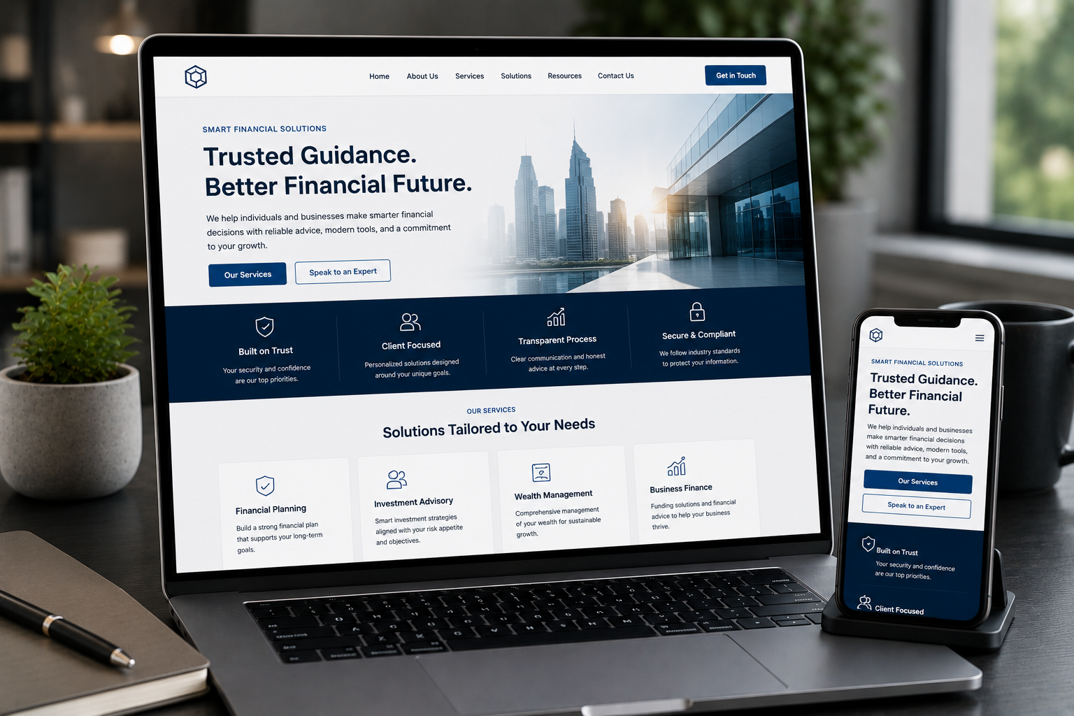
When you invest in a new website for your service business, SaaS platform, or e-commerce brand, the expectation is simple: it must look professional and, more importantly, it must drive growth. Yet, I often encounter businesses with stunning, modern websites that are quietly underperforming. They look fantastic in a portfolio, but they fail the true test of a business asset: generating leads, building trust, and converting visitors into paying customers. The visual design may be flawless, the animations smooth, and the brand color palette perfect. But if a website is a profit engine, conversion rates are the fuel efficiency—and an inefficient engine drains your marketing budget without delivering returns. A beautiful design is the minimum requirement. The difference between a high-converting website and a high-bouncing website lies in three overlooked pillars: clarity, trust, and underlying technical performance. This guide will break down the crucial design, UX, and technical mistakes that silently sabotage your website’s ability to convert, offering practical strategies to fix them.
The Clarity Crisis: When Users Are Too Confused to Convert
Conversion Rate Optimization (CRO) often starts with fixing confusion. A confused mind always says no. If a visitor cannot immediately understand what you do, who you do it for, and what they should do next, they will leave. You have roughly five seconds to communicate your value proposition before a visitor decides to stay or go.
Mistake: Ambiguous Value Proposition and Vague Language
Many business websites use high-level, corporate jargon that sounds good but says nothing specific. Phrases like "We deliver innovative, end-to-end solutions" or "Optimizing synergistic operational efficiency" are conversion killers. They prioritize sounding smart over being clear. The Fix: Apply the 5-Second Rule Every key page—especially your homepage and landing pages—must pass the 5-second clarity test. A first-time visitor should be able to answer these three questions instantly:
- (e.g., "Full-stack development for React/Next.js SaaS dashboards.")
- (e.g., "Faster product development and cleaner code.")
- (e.g., "Request a project consultation.") Focus on simplicity and directness. Your headline should be a statement of benefit, not a declaration of corporate ambition.
Mistake: Missing or Buried Calls-to-Action (CTAs)
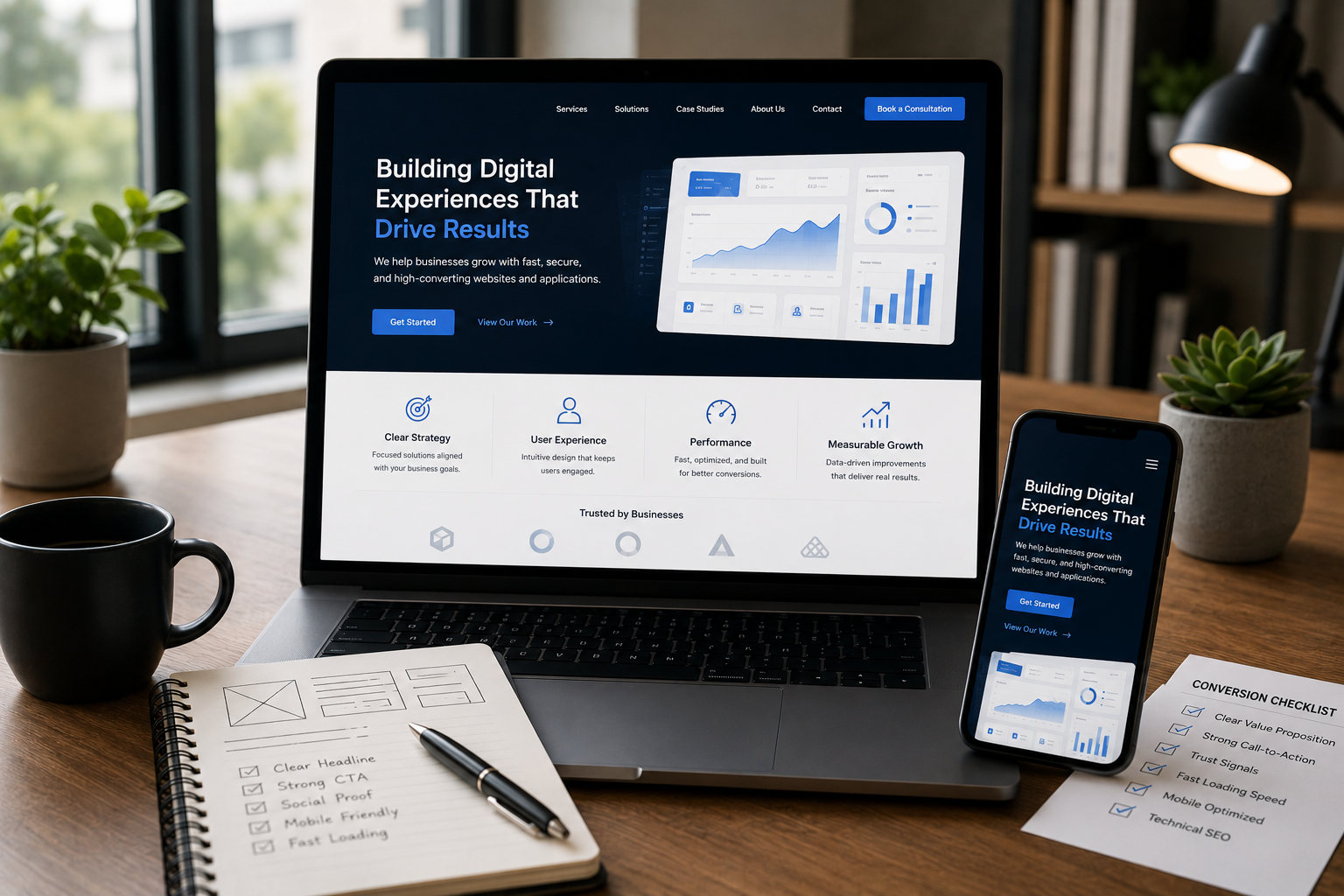
This is one of the most common mistakes: the page looks beautiful, but the next logical step for the user is unclear. Websites that lack a prominent, single-minded call to action suffer from "choice paralysis." If a user sees five equally weighted buttons ("Read More," "See Our Work," "Contact Us," "Download Guide," "Join Newsletter"), they often choose none. The Fix: Define Primary and Secondary CTAs Every screen section should have a clear purpose and a corresponding CTA.
- The single most important action (e.g., "Start Your Project," "Request a Demo," "Get Pricing"). This button must use a contrasting color and clear action language.
- A lower-friction, alternative action for users not yet ready for the primary ask (e.g., "View Case Studies," "Read the Guide," "See Services"). This should be less visually dominant—perhaps a link or a ghost button. On long pages, repeat your primary CTA logically as the user scrolls, ensuring it is always within reach as they consume more information and build conviction.
Mistake: Unclear Information Hierarchy and Flow
Visual flow is the map you give your user. If all elements—text, images, headings, and sidebars—are given equal weight, the page becomes a flat wall of content. This forces the user to apply mental effort to decode the page, which increases friction and leads to abandonment. The Fix: Guide the Eye with Visual Weight Structure your pages to naturally lead the visitor down the conversion path.
- These aren't just for SEO; they are structural anchors that let a user scan the page quickly.
- Don’t clutter sections. Giving key elements (your CTA, your primary headline) room to breathe makes them stand out and communicates importance.
- On a service page, the content flow should be: Problem Statement → Your Solution → Proof/Credibility → Next Step (CTA). If you interrupt this flow, you break the user's focus.
The Trust Takedown: Why Visitors Hesitate to Enquire
For service businesses, SaaS platforms, and e-commerce brands, trust is the currency of conversion. Visitors will not commit time, money, or personal information unless they feel secure and confident in your brand. A website that looks generic or fails to provide credible assurance is effectively turning away high-value leads.
Mistake: Hiding Credibility and Social Proof
Proof matters. A great website should not just claim expertise; it must demonstrate it. Many sites make their best-performing case studies or client wins difficult to find, or rely on stale, general testimonials. The Fix: Implement and Update Trust Signals Strategically Trust signals must be placed at critical decision points: above the fold, near the contact form, and before the checkout button.
- If you work with recognizable brands, their logos should be prominently displayed near the top of the homepage or service page. This is called "borrowed trust."
- Use testimonials that focus on a specific, measurable result or a particular pain point you solved, rather than generic praise. Include a name, title, and company where possible to increase credibility.
- Don't just link to a case study page. Extract a compelling one-paragraph summary and place it on the relevant service page, showing a direct connection between your work and a successful outcome.
- For e-commerce or any site collecting sensitive data, visible security badges (SSL status, payment provider logos) reassure the user that their data is protected.
Mistake: Unprofessional or Overly Complex Enquiry Forms
Your contact form or lead capture form is the final barrier to conversion. High friction here kills more leads than almost any other element. Friction includes forms that ask for too much irrelevant information, look broken, or don't provide context. The Fix: Minimize Friction and Maximize Context You must make the commitment feel small, even if the value is large.
- Only ask for information you must have to start the conversation (Name, Email, and a single field for the project scope or question). Every extra field (Fax Number, Company Size, etc.) you add can reduce conversion by double digits.
- For more complex data (like a detailed project estimate), use a multi-step form. Breaking a long request into 2-3 short screens feels less daunting to the user than one long scrolling form.
- Directly below the "Submit" button, add a sentence like, "We respond within one business day," or "Your information is 100% confidential." This reduces anxiety and confirms the next step.
Mistake: Weak or Non-existent Policy and Contact Transparency
In an era of increasing privacy concern, businesses must be transparent. If a visitor cannot easily find your contact details, privacy policy, or terms of service, it immediately raises a red flag. This applies especially to websites handling payment, subscriptions, or sensitive data. The Fix: Be Professionally Transparent
- Provide a dedicated contact page with an email address, phone number, and perhaps a physical address (if relevant). Don’t hide behind a form alone.
- Your Privacy Policy, Terms of Service, and Disclaimer links must be accessible from the footer of every page. This is a foundational expectation for legal compliance and trust-building.
- Increasingly, an accessibility statement signals that you care about all users, which contributes to overall brand credibility.
The Technical Debt Drain: Performance That Kills Momentum
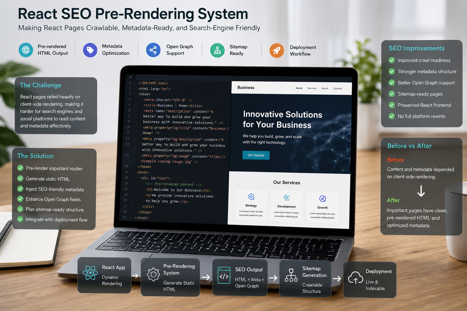
A website may have a great design and clear messaging, but if the underlying code base is slow, bloated, or non-compliant with search engine standards, it will fail to convert. Users will not wait for a sluggish page to load, especially on mobile. These technical issues often fall under SEO Engineering & Technical SEO, demonstrating how design and engineering are inseparable parts of the conversion puzzle.
Mistake: Ignoring Core Web Vitals (The Speed Problem)
Google’s Core Web Vitals (CWV) are now essential for user experience and ranking. They measure real-world performance. A beautiful website built on top of inefficient code, large unoptimized images, or excessive third-party scripts will fail these metrics, leading to frustration and high abandonment rates.
- How quickly the main content of the page loads. A slow LCP means users are staring at a blank screen or a placeholder for too long.
- How quickly the page responds to a user's click or tap. A high INP means the page feels laggy and unresponsive when they try to click a menu or button. The Fix: Optimize the Frontend Delivery
- Compress all images and serve them in modern formats (like WebP). Implement lazy loading for images below the fold.
- Ensure your JavaScript is efficient and only loading what's necessary for the current page view, reducing initial load time.
- If your CMS (like WordPress) or server is slow, no amount of frontend optimization will fix the problem. Investing in high-performance hosting or optimizing backend queries is essential.
Mistake: Poor Mobile Responsiveness and Layouts
Today, a significant percentage of business enquiries and e-commerce traffic comes from mobile devices. If your website is not truly mobile-first, it will fail to convert this audience. Poor responsiveness is not just about shrinking the desktop view; it’s about optimizing the mobile experience for touch, speed, and focus. The Fix: Design for the Thumb and the Small Screen
- Ensure your primary call-to-action button is large, tappable, and located where the user's thumb naturally rests.
- Remove non-essential elements from the mobile view. Every pixel is precious. What matters most? The value proposition and the CTA.
- Mobile keyboards and small input fields increase form friction dramatically. Ensure input fields are large enough, use the correct keyboard type (e.g., number pad for phone fields), and validate in real-time to avoid errors.
Mistake: Conversion-Killing Technical SEO Failures
Technical SEO errors are invisible to the average user, but they cripple a site's ability to be indexed and presented correctly by search engines—which is the gateway for organic conversion. These are issues that a professional developer must address, connecting the development stack to search engine standards. The Fix: Implement Clean Technical Structure and Metadata
- Ensure every page has a properly defined canonical tag. Incorrect canonical tags confuse search engines, prevent the intended page from ranking, and waste crawl budget.
- Every page needs an accurate, conversion-focused meta title and meta description. These snippets are your final chance to convert a searcher on the results page (SERP) into a visitor.
- Use relevant Schema Markup (like Organization, FAQPage, or Product) to give search engines structured data about your content. This can lead to rich snippets, improving visibility and click-through rates, which is the first step in the conversion journey.
- You must ensure that pages intended for conversion are not accidentally blocked by the robots.txt file or marked as 'noindex.' A page that cannot be indexed cannot convert.
A Practical Conversion-Focused Audit Checklist
To move your website from a beautiful brochure to a high-performing lead generator, run through this audit checklist.
- Is the core value proposition explained in the headline and sub-headline? Does the page tell the visitor what they get and who it’s for?
- Does every scroll depth on the primary conversion path (e.g., your service page) feature one clear, distinct primary Call-to-Action? Is it using a high-contrast color?
- Can a user complete the primary conversion action (e.g., filling out the contact form) in under 60 seconds? Reduce form fields to the absolute minimum necessary (Name, Email, Message/Scope).
- Are at least two high-credibility trust signals (client logos, specific testimonials, security badges) visible above the fold on your most important conversion pages?
- Check your website's performance using tools like PageSpeed Insights. If your Largest Contentful Paint (LCP) is over 2.5 seconds, you are losing valuable mobile traffic.
- Test the site on a physical phone. Is the text readable? Are the buttons easy to tap? Are there any horizontal scrolling issues or broken layouts?
- Confirm that all service pages are properly indexed and are not suffering from canonical issues, slow server response times, or unnecessary noindex directives.
- Is it easy for a visitor to jump from a high-level service overview to a detailed case study or the contact form without returning to the main menu?
Ready to Turn Your Visitors into Enquiries?
A beautiful website is just the foundation; true success is engineered through meticulous attention to user experience, trust architecture, and robust technical performance. The goal is to create a frictionless pathway where high-value visitors—whether business owners, SaaS teams, or e-commerce managers—can quickly find clarity, build confidence, and take action. If your website is visually stunning but struggling to deliver results, you are missing out on significant revenue opportunities. The design and technical issues that hurt conversion are often small but critical, requiring a blend of strategic design thinking and deep engineering expertise to diagnose and fix.
Stop Losing Leads: Get a Conversion-Focused Website Review
If your beautiful website isn't delivering enquiries, let's diagnose the technical and design issues preventing conversion. Get a clear plan to turn visitors into customers. This work falls squarely under professional Website Design & Development. I focus on building sites with clean structure, strong UX, and SEO-aware implementation right from the start, ensuring your digital presence is built for profit, not just presentation.
Frequently Asked Questions
What is the single biggest design mistake that hurts conversions?
The lack of a clear, single Call-to-Action (CTA) per page or section, which creates 'choice paralysis' and confusion for the user. When presented with too many equally weighted options, users often choose to do nothing.
How does technical SEO affect conversion rate?
Technical SEO issues like slow loading speed (Core Web Vitals) and poor mobile responsiveness create friction and frustration, causing visitors to abandon the site before they can convert. Furthermore, issues with canonical tags or indexing prevent the correct pages from attracting organic traffic in the first place.
What are 'trust signals' and why are they important for business websites?
Trust signals are elements like client logos, testimonials, clear privacy policies, and security badges that demonstrate credibility and help visitors feel safe sharing their information or making a purchase. They bridge the gap between initial interest and final commitment.
Should I prioritize design aesthetics or conversion rate optimization (CRO)?
You should prioritize CRO. A high-converting website is one that efficiently serves the business goal, even if it sacrifices some visual flair for functional clarity. Clarity and function always beat complex, distracting aesthetics in the pursuit of revenue.
How often should a business run a conversion audit?
A conversion audit should be run at least once a year, and continuously if high-traffic pages or new marketing campaigns are launched. Any time a major design change or new feature is deployed, a new audit is necessary to ensure the conversion path remains optimized.