Article
Discover the strategic design principles that elevate your service website's perceived quality without resorting to visual clutter or unnecessary features.
Learn the practical steps to design a service website that looks high-end and trustworthy. Focus on strategic whitespace, clear messaging, structured layout, and conversion-focused trust signals.
How to Build a Service Website That Feels Premium Without Looking Overdesigned
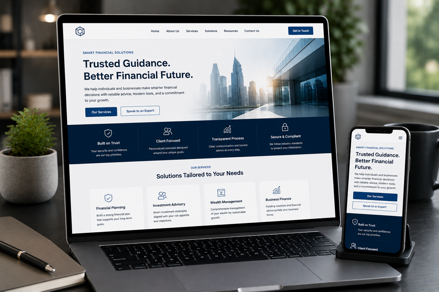
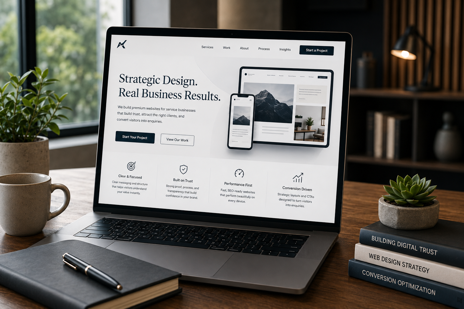
For any business that provides high-value services—from B2B consulting to custom development—your website is not a brochure; it is your digital handshake. The goal is to convey competence, build instant trust, and position your brand as a professional peer, all before a potential client ever clicks 'Contact Us.' Many business owners chase a 'premium' look by adding complex animations, busy backgrounds, and a kaleidoscope of features. This often results in a website that is cluttered, slow, and overwhelming—the opposite of professional. True premium design whispers quality through restraint, clarity, and intention. It is not about overdesigning; it is about strategic editing. A genuinely premium service website requires four core elements to feel authoritative and conversion-focused: strategic layout, generous whitespace, confident messaging, and engineered trust sections. We will break down how to implement these principles, ensuring your website serves as a high-value business asset.
The Power of Strategic Layout and Visual Hierarchy
A professional website feels deliberate, not accidental. The layout is the invisible structure that guides a visitor's eye and controls their journey from initial interest to inquiry. Premium layout is about making the next step obvious and prioritizing information ruthlessly.
The Single-Focus Principle
Every premium page component—from the Hero section to the smallest footer link—must serve a clear purpose. Overdesigning often begins when designers try to make too many things look important. A premium layout is a study in prioritization.
- Focus on the Goal: For a service website, the goal is always conversion (an inquiry, a meeting, or a quote request). Every section should contribute to this goal. If a design element doesn't guide the user toward understanding your value or taking the next step, it is visual noise and should be removed.
- Establish Clear Flow: Arrange your content sections to answer a natural progression of client questions:
- Hero: What problem do you solve? (Clarity)
- Trust/Proof: Have you solved this before? (Credibility)
- Services: How exactly do you solve it? (Mechanism)
- Process: What is it like to work with you? (Confidence)
- CTA: What is the next immediate step? (Action) A clean structure ensures visitors don't have to search for answers, reducing friction and increasing the feeling of competence.
Guiding the Eye with the F-Pattern and Z-Pattern
While modern design has evolved past rigid adherence to reading patterns, understanding how people scan a webpage is essential for placing critical information.
- The Z-Pattern (Best for simple landing pages): The eye moves across the top (logo to key CTA), then diagonally down the page to the bottom, and finally across the bottom (from secondary content to primary CTA). This pattern emphasizes the top and bottom visual lines, making it excellent for showcasing the Hero message and the final Call to Action.
- The F-Pattern (Best for content-heavy service pages): Visitors scan across the top, down the left side, and then across slightly shorter lines. For detailed service pages, this means your key service features, bulleted benefits, and important technical details should be placed along the left column or in clear, easily scannable lists. Actionable Layout Checklist:
- Hierarchy Check: Is your main service heading (H1) undeniably the largest and most prominent element?
- Consistency: Are your spacing ratios (margins and padding) consistent between sections and within text blocks? Inconsistency looks amateurish.
- Mobile-First: Does the layout feel professional on mobile? If your mobile site feels like an afterthought, so does your brand. Ensure section stacking is logical and buttons are touch-friendly.
Whitespace: The Active Element of Premium Design
Nothing telegraphs premium quality more effectively than generous, purposeful whitespace. Whitespace, also called negative space, is not just empty background; it is an active design element that creates visual breathing room and allows important elements to command attention without competing for focus. Overdesigning is almost always characterized by a lack of whitespace, cramming elements together until the page feels chaotic and overstimulating. Premium businesses use restraint.
Macro vs. Micro Whitespace
To use whitespace effectively, you must consider it at two scales:
- Macro-Whitespace: The large, unmarked areas that separate major page sections (e.g., the space between your 'Hero' and your 'Services' section). This space creates clear content boundaries and prevents cognitive overload. A generous gap here is a hallmark of high-end design.
- Micro-Whitespace: The fine-tuning of space within text blocks. This includes line height, letter spacing, and paragraph margins. Properly managed micro-whitespace enhances readability and reduces eye strain during extended browsing. This is where the choice of typography also plays a critical role. A grotesque or simple, elegant font can keep focus on the content, not the font itself.
Whitespace Audit for Clarity
Use this quick audit to identify areas where your website layout is feeling cluttered:
| Focus Area | Premium Decision | Amateur Mistake |
|---|---|---|
| Header/Navigation | Curated menus with 5–7 top links; uses micro-motion for depth. | Sprawling mega-menus; too many contact options crammed together. |
| Section Breaks | Large, intentional vertical margins between sections. | Sections bleed into each other without clear separation. |
| Text Readability | Ample line height (1.5–1.7x font size); clean typography system (max 2 complementary fonts). | Tight line spacing; multiple competing fonts or decorative choices that hinder reading. |
| Image Use | Images are large, high-resolution, and have clear visual breathing room around them. | Small images packed tightly against text or used as dense background patterns. |
| Remember, giving elements room to breathe instantly makes your website feel more professional and inviting. |
Confidence in Messaging: Writing Quiet, Not Shy
A service website visitor has seconds to decide if you are credible. In premium design, messaging is as important as the layout. High-end clients are not looking for the cheapest option; they are looking for the best option—someone who takes their craft seriously and speaks with authority. Luxury copy is quiet, not shy. It says just enough to leave the reader curious and confident.
The Hero Section Clarity Formula
The Hero section is your most valuable real estate. It must function as a rapid-fire elevator pitch, delivering absolute clarity in three seconds or less.
- Clear Headline (What): Define the core service or outcome immediately. Example: "We Engineer Custom E-commerce Dashboards" or "Full-Stack Development for Scaling SaaS Platforms."
- Supporting Sub-headline (Who/Why): State who you serve and the primary benefit they gain. Example: "Helping B2B Founders transition from MVP to a production-ready React/Next.js environment."
- Visible CTA (Next Step): Use a confident and clear call to action. Example: "Start Your Project Inquiry" or "Review Our Process."
Avoiding the 'Catalogue' Mentality
A cluttered website often tries to list every service imaginable, leading to decision paralysis for the visitor. Premium messaging avoids the 'I have every service imaginable!' tone and instead focuses on specialization: 'I specialize in exactly this'.
- Curate, Don't Catalogue: Keep service menus short and purposeful. Instead of listing 20 micro-tasks, group your services into strategic outcomes (e.g., instead of listing 'PHP development' and 'Database configuration,' offer 'Full-Stack Development').
- Precision over Poetry: While your headers can be lyrical, your service descriptions must be factual, focused on intent, and concise. Short sentences and defined terms suggest control and competence. If a concept is technical (like SEO Engineering & Technical SEO), explain the outcome simply: "We build your website architecture for crawl efficiency and performance, ensuring high organic visibility from day one."
Engineering Trust Sections: Beyond Testimonials
Trust on a service website is not merely about having a badge or a scrolling list of testimonials; it is about providing evidence of competence and reducing perceived risk. A weak design or confusing layout is the fastest way to repel customers, signaling "DIY energy" or a lack of professionalism. The four pillars of digital trust for a high-value service business are: Proof, Process, Performance, and Transparency.
1. Proof: Beyond the Quote
While testimonials are valuable, a premium website uses them alongside stronger, more contextual proof elements:
- Client Logos (If Authorized): A simple, clean row of recognizable client logos speaks volumes. This instantly signals you have experience working with serious organizations.
- Case Study Outlines: Instead of listing every project, showcase 2-3 detailed case study summaries. Focus the content on the problem, the solution direction, and the positive business outcome—not just the design features.
- The Technical Trust Signal: If your business involves development or SEO (as with HKrafted services), a fast, high-performing website is the ultimate trust signal. Performance is a premium design element. A slow site implies technical incompetence, which is unacceptable for a high-end development service.
2. Process: Showing Your Method
Uncertainty is friction. Premium clients buy confidence. By outlining your engagement process, you eliminate uncertainty and show that the entire workflow is intentional, organized, and predictable.
- Outline 3–5 Clear Steps: Use simple visual cues (like numbered steps or icons) to explain the journey from initial contact to project delivery.
- Example: 1. Strategy & Scoping, 2. Design & Development, 3. Testing & Launch, 4. Post-Launch Support.
- Manage Expectations: Be transparent about what the client is responsible for and what you deliver. This level of clarity establishes a professional working relationship before the first call.
3. Technical Trust (SEO and Security)
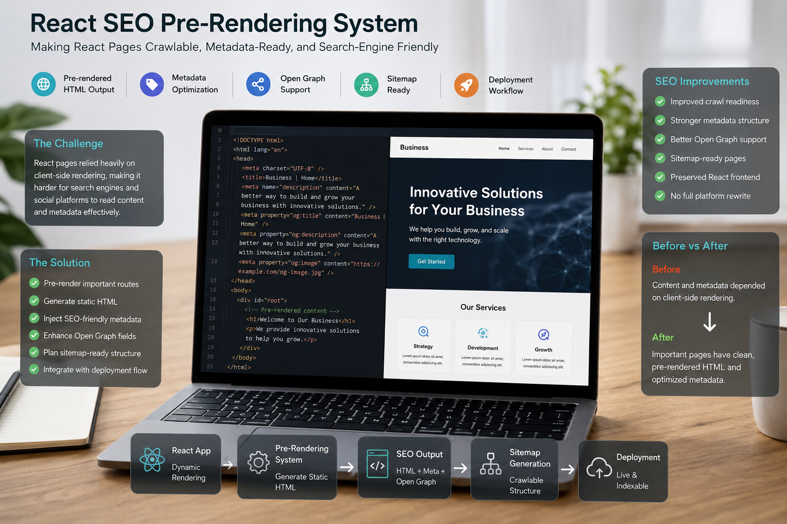
The best-looking website in the world fails if it's technically fragile. Premium design is inextricably linked with technical SEO and website performance.
- SEO as Structural Integrity: Technical SEO Engineering involves creating a logical sitemap, ensuring proper H-tag hierarchy, and optimizing for site speed. These steps are what make the site easily crawlable by search engines, and they simultaneously make the content structure clear and intuitive for users. A clean layout naturally enforces this clear structure.
- Security and Compliance: Explicitly mention security measures, such as SSL (HTTPS), to show you treat data and privacy seriously.
4. Transparency: The Footnote Details
Reassurance belongs inline, not hidden behind tooltips. Transparent service details are a form of trust-building microcopy.
- Clear CTAs: Ensure the button text is direct. Avoid vague terms like 'Submit' and use intentional phrases like 'Get a Custom Quote' or 'Schedule a Discovery Call.'
- Availability/Pricing: While you don't need to post exact pricing, a premium website should be transparent about its capacity or client profile. If your services start at a certain level, mentioning this helps filter serious clients and prevents time-wasting inquiries.
The Premium Checklist: Design with Intention
Building a premium service website is not a checklist of features, but a discipline of restraint. The key is intention—thinking about what you're doing, and then doing it deliberately.
- Audit Your Intent: Does your site immediately and clearly communicate what you do, who it's for, and why it matters without scrolling?
- Audit Your Whitespace: Are your margins generous, especially between major content blocks? Does the page feel calm, not chaotic?
- Audit Your Typography: Have you limited yourself to one or two sophisticated, highly readable font choices? Do they elevate the brand rather than cheapen it?
- Audit Your Trust: Do you rely on proof (case studies, process, performance) or just empty superlatives? By mastering layout, embracing whitespace, refining your messaging, and engineering authentic trust signals, you shift your website from a cluttered commodity to a curated, high-value asset. This approach avoids the traps of overdesigning and leaves visitors with the most crucial perception: confidence in your professionalism.
Ready to Engineer Your High-Trust Website Foundation?
For a service business, every second a potential client spends confused or searching for information is a lost opportunity. Your website's structure should be engineered for high performance, maximum clarity, and conversion flow. If you are ready to implement a clean, premium website foundation that integrates strategic design with technical SEO efficiency, HKrafted can help. We focus on building logical, conversion-focused websites—whether powered by robust CMS solutions like WordPress or cutting-edge frameworks like React / Next.js—that prioritize your business goals over fleeting design trends. Ready to Build a Premium, Conversion-Focused Website? Don't let a cluttered or amateur design hold your service business back. Let's engineer a high-trust, high-performing website foundation.