Article
A WooCommerce checkout can look simple but still create hidden friction that makes ready buyers hesitate, leave, or delay the purchase.
Checkout problems can silently reduce WooCommerce sales. Learn how friction, payment confusion, shipping issues, and trust gaps affect conversions.
Why WooCommerce Stores Lose Sales at Checkout
A WooCommerce store can have good products, strong traffic, attractive product pages, and a clear brand, but still lose customers at checkout. That is frustrating because checkout is the final step. The buyer has already browsed, compared, added a product to the cart, and shown purchase intent. At that point, the website should make the next step feel simple and safe. But many WooCommerce checkouts do the opposite. They ask for too much information. They show shipping costs too late. They make payment options unclear. They look different from the rest of the website. They feel slow on mobile. They hide important trust details. Sometimes, they simply do not explain enough. Checkout problems are not always dramatic. Most of the time, they are small points of friction that add up. The buyer does not always think, “This checkout is bad.” They simply pause, doubt the purchase, get distracted, or decide to come back later. This blog explains the most common reasons WooCommerce stores lose sales at checkout and how to improve the experience in a practical, structured way.
Checkout Is Not Just a Payment Page
Many store owners think checkout is only the place where customers enter billing details and pay. That is too narrow. Checkout is a decision point. At checkout, the customer is asking:
- Is this store trustworthy?
- Is the final price clear?
- Is shipping reasonable?
- Will delivery work for my location?
- Can I pay using my preferred method?
- Can I return the product if something goes wrong?
- Is this website secure?
- Is the process easy enough to finish right now? If the checkout does not answer these questions clearly, the customer may leave even if they liked the product. A good WooCommerce checkout removes doubt. A weak checkout creates it.
Reason 1: The Checkout Form Feels Too Long
One of the most common checkout problems is asking for too much information. Some WooCommerce stores show fields that are not needed for the actual order. Others use default checkout fields without reviewing whether they make sense for the business. For example, a store may ask for:
- Company name when selling mostly to individuals
- Address line 2 when it is rarely needed
- Order notes in a way that distracts the buyer
- Separate billing and shipping details even when most buyers use the same address
- Account creation before purchase
- Too many optional fields without clear purpose Every extra field adds mental effort. That does not mean all fields should be removed. Some products need detailed shipping, tax, invoice, or compliance information. But every field should earn its place.
A Better Approach
Review the checkout form and ask:
- Is this field required to complete the order?
- Does the customer understand why this field is needed?
- Can this field be optional?
- Can it be moved after purchase?
- Can it be auto-filled or simplified?
- Does this field create confusion on mobile? The goal is not to make checkout empty. The goal is to make it focused.
Reason 2: Shipping Costs Appear Too Late
Shipping is one of the biggest points of hesitation in ecommerce. If a customer only sees shipping cost at the final step, it can feel like a surprise. Even when the cost is fair, the timing can create frustration. WooCommerce stores often lose buyers when shipping information is unclear across the journey. Common issues include:
- No shipping estimate on product pages
- No delivery information before checkout
- Free shipping rules that are hard to understand
- Shipping methods with unclear names
- Delivery timelines missing from checkout
- Location restrictions shown too late
- Unexpected handling fees near payment When buyers feel surprised, they slow down.
A Better Approach
Shipping should be explained before the final payment step. A stronger flow may include:
- Product page delivery notes
- Cart page shipping estimate
- Clear free shipping threshold
- Simple shipping method names
- Expected delivery range
- Return policy link near checkout
- Location availability notes where needed For example, instead of showing only “Flat Rate,” a store can use clearer labels like “Standard Delivery” or “Express Delivery” if that matches the actual fulfillment process. The customer should not need to guess what they are paying for.
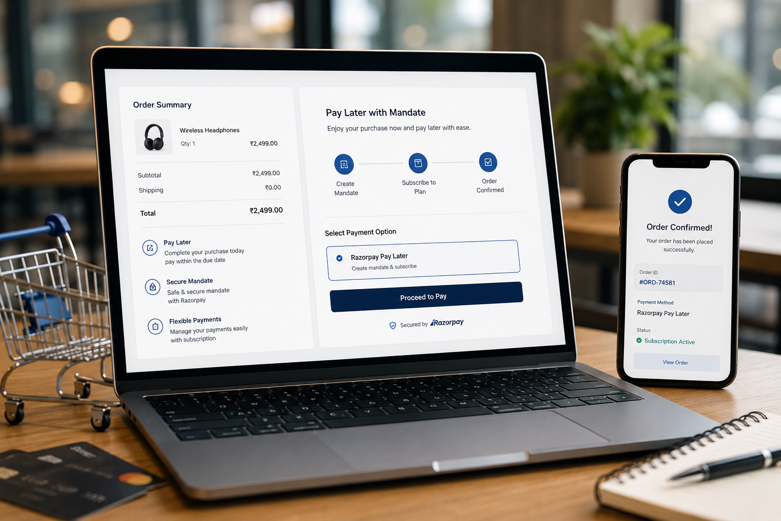
Reason 3: Payment Options Do Not Match Buyer Expectations
A checkout can look fine but still fail because the payment flow feels limited or unreliable. Payment issues can include:
- Too few payment methods
- Payment gateway errors
- Confusing payment labels
- Redirects that feel unsafe
- Failed card validation
- Missing local payment options
- Poor mobile payment experience
- No clear confirmation after payment The right payment setup depends on the store, market, and customer type. A local brand may need region-specific payment methods. A premium ecommerce store may need credit card, wallet, and pay-later options. A B2B WooCommerce store may need invoice or bank transfer workflows. A digital product store may need instant access after payment. There is no single perfect payment setup for every store.
A Better Approach
Payment options should feel familiar, clear, and stable. Check:
- Are the payment methods relevant to the target buyer?
- Are payment labels easy to understand?
- Does the payment gateway work well on mobile?
- Are failed payment messages clear?
- Is the order confirmation page helpful?
- Are abandoned or failed payments trackable?
- Are payment plugins updated and tested? Payment is not only a technical step. It is a trust step.
Reason 4: The Store Does Not Build Enough Trust
At checkout, buyers become more sensitive. They are about to share personal information, address details, and payment information. If the store feels incomplete or inconsistent, they may hesitate. Trust issues can come from many places:
- Poor visual design
- Inconsistent branding
- Missing contact details
- No return or refund policy
- No delivery explanation
- No secure payment messaging
- Broken layout on mobile
- Product pages that do not answer enough questions
- Checkout page that looks different from the main website The buyer may not consciously list all these problems. But they feel them. A WooCommerce checkout should reassure the buyer without overwhelming them.
Useful Trust Signals
Good trust signals include:
- Secure checkout message
- Payment method logos
- Short return policy link
- Delivery information
- Support email or contact link
- Clear business identity
- Consistent header and branding
- Order summary that is easy to review
- Product image and quantity confirmation Trust signals should be placed near decision points, not hidden in the footer.
Reason 5: Mobile Checkout Is Hard to Use
Many buyers browse and purchase from mobile devices. A checkout that works on desktop may still feel painful on a phone. Mobile checkout problems often include:
- Small input fields
- Buttons too close together
- Long scrolling forms
- Coupon field taking too much attention
- Payment iframe not fitting well
- Sticky elements covering form fields
- Slow page loading
- Address fields difficult to complete
- Error messages appearing far away from the field Mobile checkout should be tested like a real buyer would use it. That means adding a product to cart, going through checkout, filling fields, applying coupon codes, selecting shipping, trying payment, and reviewing error states.
A Better Approach
For mobile, focus on clarity and spacing. Important improvements include:
- Larger tap targets
- Clear step order
- Simple field labels
- Visible order summary
- Easy payment method selection
- Clear error messages
- Reduced distractions
- Fast loading checkout page A checkout should not feel like a form from an old admin panel. It should feel like a guided purchase flow.
Reason 6: The Coupon Field Distracts Buyers
Coupon fields can help sales, but they can also create doubt. When a customer sees a coupon box at checkout, they may think:
- Is there a discount code I missed?
- Should I search for one?
- Am I overpaying?
- Can I find a better deal elsewhere? This can pull buyers away from checkout. The answer is not always to remove coupon fields. Some stores rely heavily on discount campaigns. But the coupon field should be handled carefully.
A Better Approach
Consider:
- Making the coupon field less visually dominant
- Showing applied discounts clearly
- Using automatic discounts where possible
- Keeping promotional messaging consistent
- Avoiding aggressive coupon prompts at the final step The checkout should keep the buyer focused on completing the order.
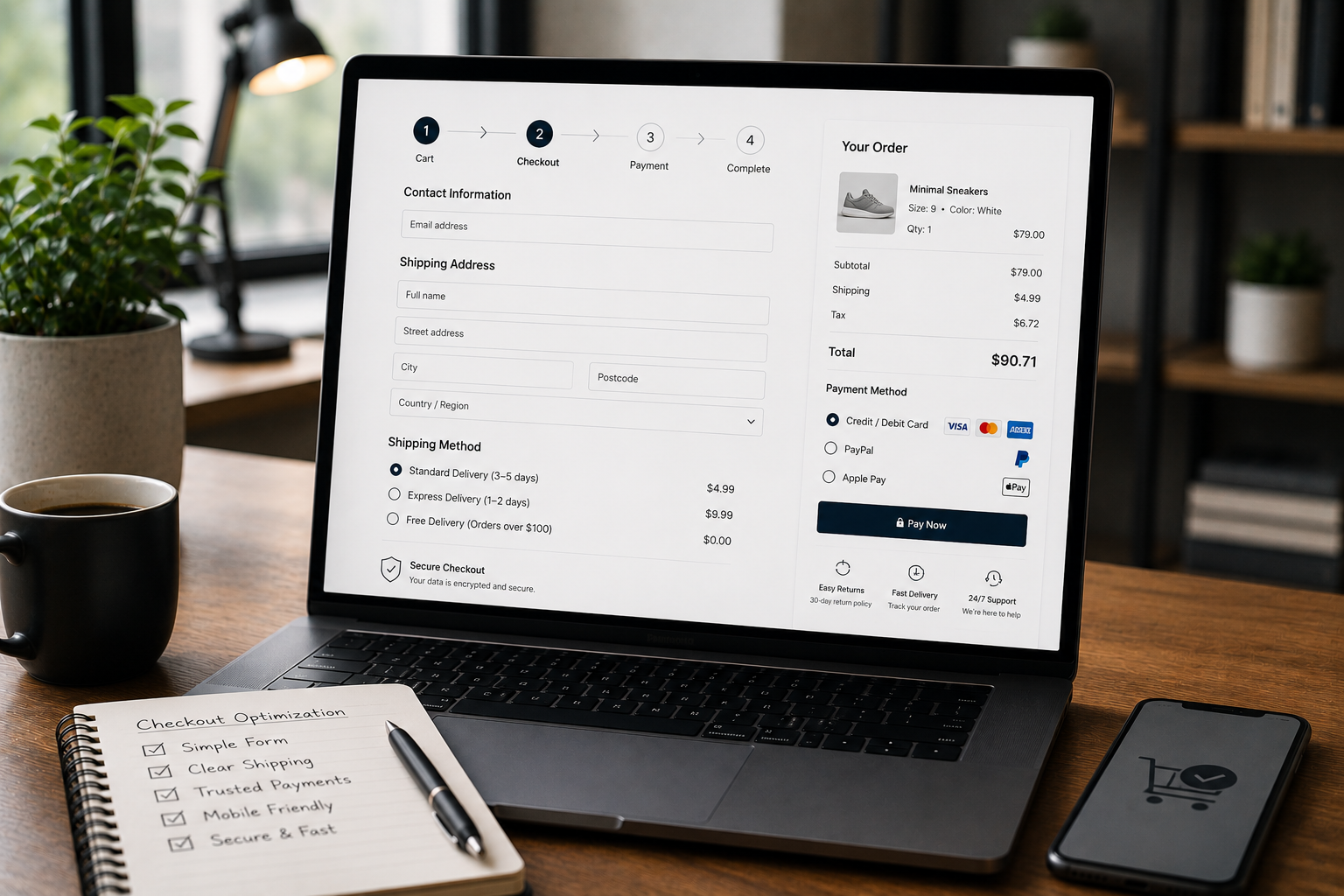
Reason 7: The Order Summary Is Not Clear
Before paying, customers want to review what they are buying. If the order summary is unclear, they may hesitate. Common problems include:
- Product names are too short or confusing
- Product images are missing
- Quantity is not obvious
- Variations are unclear
- Taxes and shipping are not separated
- Discounts are not shown clearly
- Final total is hard to find
- Subscription or recurring charges are not explained The order summary should make the buyer feel confident.
A Better Approach
A clear order summary should show:
- Product name
- Product image if useful
- Selected variation
- Quantity
- Subtotal
- Discount
- Shipping
- Tax if applicable
- Final total
- Payment method
- Delivery expectation The buyer should not need to go back to the cart to confirm basic details.
Reason 8: Checkout Errors Are Not Helpful
Errors happen. A card may fail. An address may be incomplete. A required field may be missed. A shipping method may not be available. The problem is not only the error. The problem is how the checkout explains it. Weak checkout errors often say things like:
- “Invalid input”
- “Payment failed”
- “Required field missing”
- “There was a problem” These messages do not help the buyer fix the issue.
A Better Approach
Error messages should be specific and visible. For example:
- “Please enter a valid phone number.”
- “Please select a shipping method before continuing.”
- “This payment method could not be completed. Try another card or payment option.”
- “Delivery is not available for this postcode.” Also, the error should appear near the field or section that needs attention. If the customer has to search for the problem, the checkout becomes frustrating.
Reason 9: The Checkout Page Loads Slowly
Checkout speed matters because the buyer is already close to purchase. A slow checkout can happen because of:
- Too many plugins
- Heavy scripts
- Poor hosting
- Unoptimized theme files
- Payment gateway delays
- Tracking scripts
- Large images
- Plugin conflicts
- Slow database queries WooCommerce stores often grow over time. Plugins are added for shipping, payment, discounts, analytics, subscriptions, reviews, popups, email marketing, and more. Eventually, checkout becomes heavy.
A Better Approach
Checkout performance should be reviewed separately from general website performance. Important checks include:
- Page loading speed
- Payment gateway response
- Plugin conflicts
- Cart fragments
- Unnecessary scripts
- Mobile performance
- Hosting stability
- Error logs
- Checkout-specific caching rules Do not only test the homepage. Test the cart and checkout flow too.
Reason 10: The Checkout Does Not Match the Customer Journey
A checkout should reflect what the customer already learned before reaching it. If product pages, cart, and checkout feel disconnected, the buyer may lose confidence. For example, a product page may promise easy returns, but checkout does not mention returns. A cart may show free shipping, but checkout shows a confusing shipping method. A product page may feel premium, but checkout looks basic and unbranded. A service-style WooCommerce store may need more explanation before payment, but checkout is too transactional. The full journey should feel connected.
A Better Approach
Review the full purchase path:
- Product page
- Add to cart
- Cart page
- Checkout page
- Payment step
- Thank you page
- Confirmation email Each step should support the next one. The checkout should not feel like a separate system. It should feel like the natural final step of the same brand experience.
WooCommerce Checkout Improvement Checklist
Use this checklist to review your checkout:
- Are unnecessary fields removed?
- Are required fields clearly marked?
- Is shipping explained before payment?
- Are payment methods clear and relevant?
- Is the order summary easy to review?
- Are trust signals visible near checkout?
- Is the mobile layout easy to complete?
- Are error messages helpful?
- Does checkout load quickly?
- Are plugins updated and tested?
- Is the coupon field handled carefully?
- Is the return policy easy to find?
- Is the confirmation page useful?
- Are failed payments trackable?
- Does the checkout match the brand design? This checklist does not replace deeper testing, but it helps identify common friction points.
Decision Point: Redesign or Technical Fix?
Not every checkout problem needs a full redesign. Some issues are technical. Some are content-related. Some are user experience problems. A redesign may be needed when:
- The checkout looks outdated
- The layout is confusing
- Mobile experience is poor
- The page does not match the brand
- Trust signals are missing
- The order summary is hard to understand A technical fix may be needed when:
- Payments fail
- Shipping logic is wrong
- Checkout loads slowly
- Plugins conflict
- Validation errors are unclear
- Emails are not sent properly
- Analytics are not tracking checkout behavior Many WooCommerce stores need both. The best approach is to inspect the full checkout flow before changing random settings.
Need Help Improving Your WooCommerce Checkout?
If your WooCommerce store gets traffic but checkout completion feels weak, the problem may not be the product. It may be the buying experience. Through WooCommerce Development, I can help improve checkout structure, design clarity, payment flow, shipping logic, mobile usability, and technical reliability. The goal is to make checkout easier for real customers, not just visually cleaner.
Final Recommendations
WooCommerce checkout optimization should start with the buyer’s questions. Before asking someone to pay, the store should clearly answer:
- What am I buying?
- What is the final cost?
- How will it be delivered?
- When can I expect it?
- Can I trust this store?
- What happens if something goes wrong?
- Can I pay easily?
- Is the process safe? If checkout answers these questions clearly, the purchase feels easier. Most WooCommerce stores do not lose sales because of one huge issue. They lose sales because of small points of friction across design, shipping, payment, trust, mobile experience, and technical setup. Fixing checkout means removing those doubts one by one.
FAQ
Why do customers leave a WooCommerce checkout page?
Customers often leave when the checkout feels too long, confusing, slow, untrustworthy, or unclear about shipping, payment, return policy, or final cost. Sometimes the product is not the problem. The buyer may already want the product, but the checkout creates enough doubt to delay or stop the purchase.
How can I reduce checkout friction in WooCommerce?
You can reduce friction by simplifying fields, showing clear costs, improving mobile layout, offering trusted payment options, and removing unnecessary distractions. Start by testing the checkout yourself as a customer. Add a product, use the cart, select shipping, try payment, and check how many decisions or doubts appear before the order is complete.
Do shipping issues affect WooCommerce conversions?
Yes. If shipping costs, delivery timing, location rules, or free shipping conditions are unclear, buyers may hesitate or leave before completing the order. Shipping should be explained before the final payment step whenever possible. Clear delivery information can make the purchase feel more predictable.
What trust signals should a WooCommerce checkout include?
Useful trust signals include secure payment messaging, return policy links, support contact details, accepted payment logos, clear delivery information, and consistent branding. The best trust signals are simple and relevant. They should support the buying decision without making checkout crowded.
Should WooCommerce checkout be redesigned or technically optimized?
It usually needs both. A better design improves clarity, while technical optimization fixes speed, payment, mobile, validation, and plugin conflict issues. Before making changes, review the full checkout journey. That helps separate visual problems from WooCommerce configuration or plugin problems.