Article
A Shopify product page can lose trust quickly when images, copy, reviews, shipping details, and calls to action do not answer buyer questions clearly.
Learn which Shopify product page mistakes make stores look untrustworthy and how to improve images, copy, reviews, shipping, CTAs, and UX.
Product Page Mistakes That Make Shopify Stores Look Untrustworthy
A Shopify product page has one main job: help the buyer feel confident enough to take the next step. That next step may be adding the product to cart, choosing a variant, checking delivery information, comparing options, or continuing to checkout. But before the buyer acts, they need trust. They need to understand what the product is, why it is worth considering, what they will receive, how delivery works, whether returns are clear, and whether the store feels reliable. Many Shopify stores lose trust not because the product is bad, but because the product page does not answer enough questions. The page may look nice at first glance, but the images are incomplete. The copy is vague. Reviews are missing or poorly placed. Shipping information is hidden. The add-to-cart button is not clear on mobile. The layout feels like a default theme with limited thought behind it. A product page does not need to be complicated. But it does need to feel complete.
Trust Starts Before Checkout
Many store owners think trust is built at checkout with payment logos, secure checkout messages, and return policy links. Those things matter, but trust starts much earlier. The product page is where the buyer decides whether the product is right for them. If the product page feels incomplete, the buyer may never reach checkout. A buyer is usually asking:
- What exactly is this product?
- Does it match what I need?
- What does it look like in real use?
- What size, color, material, or variant should I choose?
- Is the price justified?
- How will shipping work?
- Can I return it if it is not right?
- Does this store seem legitimate?
- What happens after I buy? A trustworthy Shopify product page answers these questions without making the buyer work too hard.
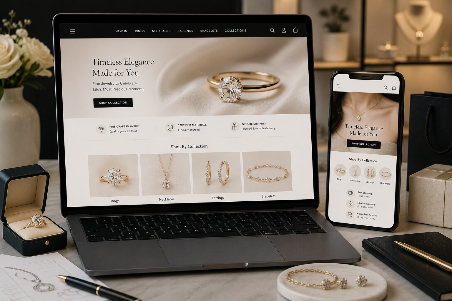
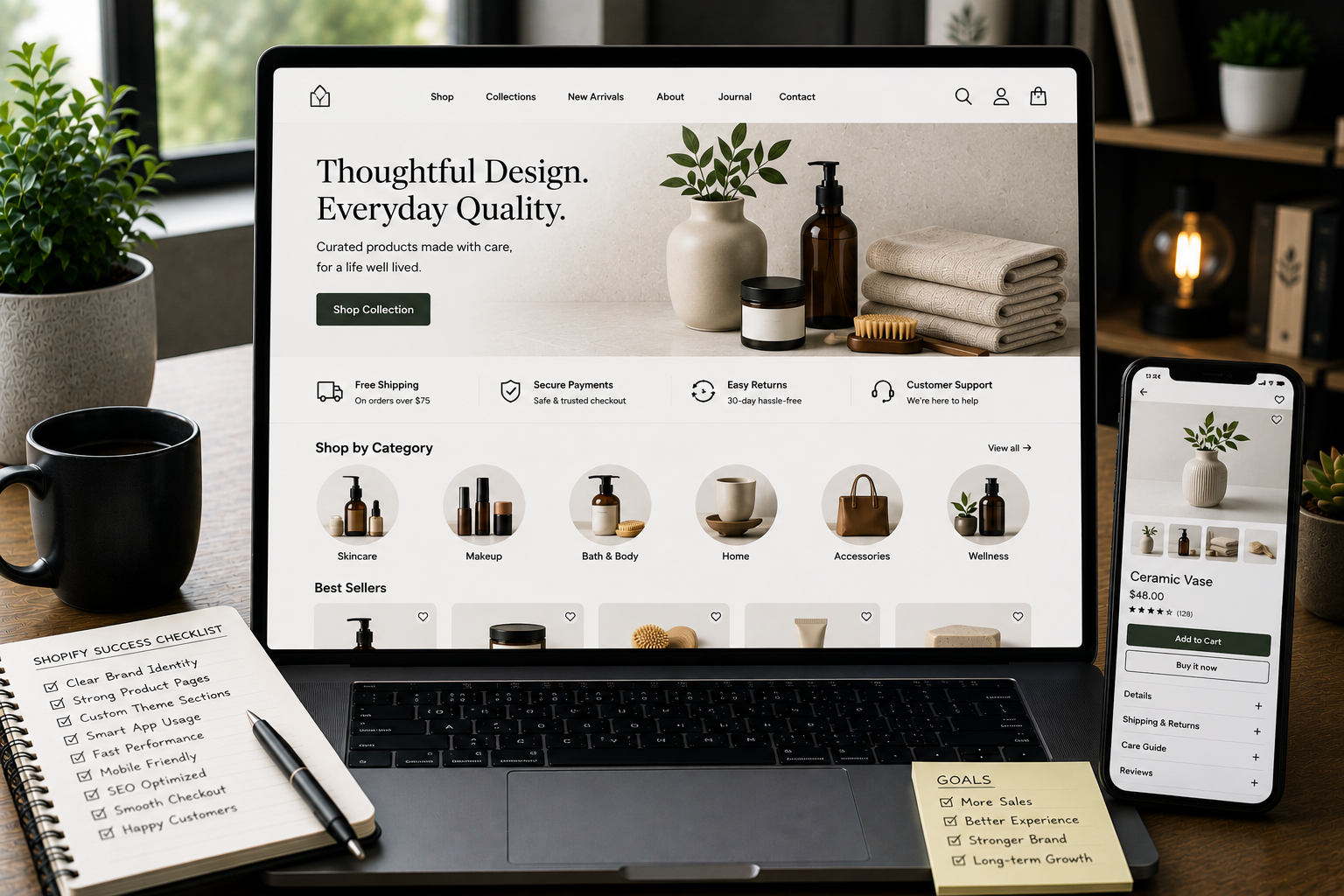
Mistake 1: Weak or Incomplete Product Images
Product images are one of the first things buyers judge. If images are blurry, inconsistent, too few, or poorly cropped, the product can feel risky. Even if the product is good, weak visuals make the store feel less professional. Common image mistakes include:
- Only one product image
- No close-up details
- No lifestyle or usage image
- Inconsistent image sizes
- Low-quality photography
- Over-edited product colors
- Missing scale or size context
- Slow-loading image galleries
- No mobile-friendly image review A buyer cannot touch the product online. Images need to do more work.
What Better Product Images Should Show
A stronger image gallery may include:
- Main product image
- Detail or close-up shots
- Product in use
- Product from multiple angles
- Packaging if relevant
- Size or scale context
- Variant-specific images
- Material or texture details The right image set depends on the product. A clothing store may need fit and fabric details. A skincare store may need texture, packaging, and usage context. A technical product may need ports, parts, measurements, and setup views. Good product images reduce uncertainty.
Mistake 2: Product Copy That Says Too Little
Many Shopify product pages use copy that sounds nice but does not help the buyer decide. Generic product copy often says things like:
- “Premium quality”
- “Made for everyday use”
- “Perfect for everyone”
- “Designed with care”
- “A must-have product” These phrases may sound polished, but they do not explain much. A buyer wants clear information. They want to know what the product does, who it is for, what problem it solves, what makes it different, and how to choose the right option.
What Stronger Product Copy Should Do
Better product copy should answer real buyer questions. Useful copy may explain:
- What the product is
- Who it is best for
- What problem it solves
- What makes it different
- What is included
- How to use it
- How to choose the right variant
- What to expect after purchase
- What limitations or care instructions matter The goal is not to write more words. The goal is to write more useful words. A trustworthy product page sounds clear, specific, and honest.
Mistake 3: No Clear Product Details
A product page can look beautiful but still feel incomplete if important details are missing. Depending on the product, buyers may need details like:
- Size
- Dimensions
- Material
- Weight
- Ingredients
- Compatibility
- Fit
- Care instructions
- Warranty information
- What is included
- Usage instructions
- Delivery restrictions
- Digital access details If these details are missing, buyers may hesitate. They may worry the product will not fit, will not work, will not match expectations, or will be hard to return.
Use Structured Details
Instead of hiding everything in one long paragraph, structure product details clearly. You can use sections like:
- Key features
- Product details
- Size and fit
- Materials
- What is included
- How to use
- Delivery and returns
- FAQs This makes the page easier to scan and easier to trust.
Mistake 4: Shipping Information Is Hard to Find
Shipping uncertainty can stop buyers quickly. If the product page does not explain shipping, the buyer may wait until checkout to find out. That creates risk. If shipping cost, delivery timing, or location availability feels unclear, the buyer may leave before paying. Common shipping mistakes include:
- No delivery estimate on product pages
- Shipping cost shown only at checkout
- Free shipping rules not explained
- Return information hidden in the footer
- Location restrictions not mentioned
- Delivery method names that are too vague
- No explanation for made-to-order or delayed items Shipping does not need to be explained in a long block. It just needs to be visible and clear.
Better Shipping Placement
Good places for shipping information include:
- Near the add-to-cart button
- Inside a product accordion
- Below product details
- Near the price
- Inside a delivery and returns section
- In a short note before checkout For example, a product page can include a simple line such as “Delivery options and return details are shown before checkout” or a more specific note if the business has a defined shipping policy. The buyer should not need to search for basic delivery expectations.
Mistake 5: Weak or Missing Reviews
Reviews are not required for every store, especially if a brand is new. But if reviews are available, they should be used clearly and honestly. A review section can build trust when it helps buyers understand real experiences. But a weak review setup can create doubt. Common review mistakes include:
- Review stars with no visible reviews
- Reviews hidden too far down the page
- Review widgets that look visually disconnected
- No filtering or helpful review content
- Overly generic review snippets
- Reviews that do not match the product
- Review app styling that clashes with the theme If reviews are not available yet, the page should still build trust with clear product details, policies, images, and brand information.
How to Use Reviews Better
When reviews exist, place them where they help. Useful review placement includes:
- Star summary near product title
- Review section below product details
- Highlighted review snippets if genuine
- Review count when available
- Product-specific reviews instead of only store-wide reviews Reviews should support the buying decision, not feel like a random widget.
Mistake 6: The CTA Is Not Clear Enough
The add-to-cart button is one of the most important elements on the product page. If the CTA is hard to see, poorly worded, hidden on mobile, or visually weak, buyers may hesitate. Common CTA mistakes include:
- Button blends into the design
- Button appears too low on mobile
- Too many competing buttons
- Variant selection is confusing
- Add-to-cart button is disabled without explanation
- Sticky button covers content
- Button text is unclear
- Payment buttons appear before the buyer understands the product The CTA should feel obvious and easy to use.
Better CTA Design
A strong product CTA should be:
- Easy to find
- Clear in wording
- Close to price and variant selection
- Supported by shipping or trust details
- Mobile-friendly
- Not surrounded by too many distractions The CTA should not do all the work alone. It should appear after the product page has given enough confidence.
Mistake 7: Variant Selection Creates Confusion
Many Shopify products have variants: size, color, material, quantity, bundle type, subscription option, or product configuration. If variant selection is unclear, the product page becomes frustrating. Common variant mistakes include:
- Color names without matching images
- Size options without a size guide
- Disabled options without explanation
- Too many dropdowns
- Variant images not updating
- Price changes not clear
- Subscription options that feel confusing
- Default selections that may mislead buyers A buyer should understand exactly what they are choosing.
Improve Variant Clarity
Better variant UX may include:
- Clear option labels
- Swatches where useful
- Variant-specific images
- Size guide link near size options
- Availability messaging
- Price updates when variants change
- Helpful notes for bundles or subscriptions Variant selection should reduce confusion, not create it.
Mistake 8: The Page Looks Different From the Brand
A product page can feel untrustworthy when it looks disconnected from the rest of the store. This can happen when a store uses too many apps, widgets, or theme add-ons. Each feature may bring its own design style, spacing, buttons, fonts, or icons. The result feels patched together. Brand inconsistency can show up in:
- Different button styles
- Mixed icon sets
- Inconsistent spacing
- Conflicting typography
- Review widget that does not match
- Trust badges that look generic
- App sections with different design rules
- Product tabs that feel disconnected A trustworthy product page feels like one experience.
Keep the Design System Consistent
The product page should follow the same design rules as the rest of the store:
- Same typography
- Same button style
- Same spacing rhythm
- Same color usage
- Same icon style
- Same tone of voice
- Same section hierarchy Consistency makes the store feel more intentional.
Mistake 9: Important Information Is Hidden in Tabs
Tabs and accordions can be useful, especially on mobile. But they can also hide important information. If every important detail is placed behind collapsed tabs, buyers may miss what they need. For example, shipping, returns, size guide, materials, and FAQs should be easy to find. They can be organized in accordions, but the headings should be clear and placed near the buying decision.
Use Tabs Carefully
Good tab or accordion labels include:
- Product details
- Size and fit
- Materials
- Delivery and returns
- How to use
- FAQs Poor labels include vague headings like:
- More info
- Details
- Other
- Info The buyer should know what they will find before opening the section.
Mistake 10: Mobile Product Pages Are Hard to Use
A product page that looks fine on desktop can still fail on mobile. Mobile buyers need fast loading, clear images, easy scrolling, simple variant selection, readable text, and a visible CTA. Common mobile mistakes include:
- Large hero images pushing content too far down
- Add-to-cart button hard to find
- Variant selectors too small
- Product descriptions too long without structure
- Sticky elements covering content
- Popups interrupting browsing
- Image galleries difficult to swipe
- Reviews or widgets loading slowly
- Shipping information hidden too low Mobile product pages should be tested on real devices, not only inside a desktop preview.
Mobile Product Page Checklist
Check whether the buyer can easily:
- View product images
- Understand the product quickly
- Select the right variant
- Find shipping information
- Read key details
- Add to cart
- See price and availability
- Open FAQs
- Continue to checkout If any of these actions feel difficult, the page needs improvement.
Mistake 11: SEO Content Is Treated as an Afterthought
Product pages need to serve buyers first, but SEO structure still matters. A weak product page may have:
- Duplicate product descriptions
- Missing meta title
- Missing meta description
- Poor heading structure
- No useful internal links
- No alt text for images
- Thin content
- Unclear product naming
- No FAQ content
- Poor collection linking SEO-friendly product pages are not just keyword pages. They are helpful pages. A better product page should clearly explain the product, support internal linking, use descriptive headings, include useful image alt text, and make the content easy to understand. This helps both users and search engines.
Product Page Trust Checklist
Use this checklist to review your Shopify product pages:
- Are product images clear and complete?
- Does the product copy answer real buyer questions?
- Are key details easy to scan?
- Is shipping information visible before checkout?
- Are return details easy to find?
- Are reviews placed clearly when available?
- Is the add-to-cart button easy to use?
- Are variants simple to understand?
- Does the page match the brand design?
- Is the mobile experience smooth?
- Are trust signals placed near decision points?
- Is the SEO structure clean?
- Does the page reduce doubt before asking for the sale? If several answers are no, the product page may be hurting trust.
Need Better Shopify Product Pages?
If your Shopify store gets visitors but product pages do not feel trustworthy, the issue may not be traffic. It may be the page structure, product content, image strategy, CTA placement, mobile UX, or theme design. Through Shopify Development, I can help improve product page templates, custom sections, product content layout, trust signals, mobile usability, and SEO-friendly structure. The goal is to make each product page clearer, more useful, and easier to trust.
Final Recommendations
A trustworthy Shopify product page is not built from one feature. It is built from many clear decisions working together. Start with these areas:
- Better product images
- Clear product copy
- Useful details
- Visible shipping and return information
- Honest reviews when available
- Strong CTA placement
- Clear variant selection
- Consistent design
- Mobile-friendly layout
- SEO-friendly content structure The product page should make the buyer feel informed, not uncertain. When product pages answer questions clearly, buyers do not need to guess. That is what makes a Shopify store feel more trustworthy.
FAQ
Why do Shopify product pages look untrustworthy?
Shopify product pages can look untrustworthy when images are weak, copy is vague, shipping details are missing, reviews are unclear, CTAs are poorly placed, or the design feels inconsistent. Trust is built through clarity. If the buyer has too many unanswered questions, the product page will feel risky.
What should every Shopify product page include?
A strong Shopify product page should include clear images, useful product copy, key details, variant information, shipping and return notes, trust signals, reviews when available, and a clear add-to-cart action. The exact sections depend on the product, but the page should always help the buyer understand what they are buying.
Do product images affect trust on Shopify stores?
Yes. Product images help buyers understand quality, size, use, details, and context. Incomplete or inconsistent images can make the product feel risky. Good images reduce uncertainty because they show the product from the buyer’s point of view.
Where should shipping information appear on a Shopify product page?
Shipping information should appear near the buying decision, usually close to the add-to-cart area or in a clear product detail section, so buyers do not need to search for it. If delivery or returns are important to the purchase decision, they should not be hidden only in the footer.
How can I improve Shopify product page conversion?
Improve conversion by making the product easier to understand, removing doubt, showing clear visuals, adding practical details, improving mobile UX, and placing CTAs and trust signals where buyers need them. A better product page does not pressure the buyer. It helps them feel confident enough to continue.